Julianna Carlson-van Kleef | 17/05/2022
Trends from Mono’s Best Website Competition 2022
There are a lot of articles on yearly trends – but have you ever thought to ask yourself, where are the authors of these articles or blogs finding this trend information?
With our yearly Best Website Competition, we see many high-quality, real-world examples of small business websites from all around the world. And as the Mono team combs through the sites to find the Best Website Competition winner, looking at the many different facets of a well-designed website, we can see trends emerge.
So, what trends did the Mono team see from this year’s competition? Before we address that question, let us review what the Best Website Competition judging panel was asked when reviewing submission entries:
• Is the site designed to build trust with website visitors?
• Is the site optimized for conversions?
• Is the site responsively and accessibly designed?
• Does the site use visuals nicely?
• Does the site have a nice use of fonts and typography?
• Does the site have a good or creative layout?
• Does the site creatively use the Mono Editor?
With an eye on each of these questions, the judging team then noticed both emerging similarities and new uses of features for each of these different facets of website design.
Building Trust
As written in the blog post How to create a trustworthy small business website, a website serves two primary functions: Build trust and drive conversions. There are many ways that a small business website can build trust with website visitors. The first is having an “About us” page for a multipage site or a comparable section on a single page site. A second way is to signal to website visitors that the website takes GDPR and the privacy of its website visitors seriously.
Achieving data compliance can be incredibly difficult and time-consuming – even for large companies with a team of legal experts. So, for small businesses, it is helpful to have an automated consent solution to reduce data compliance headaches, as keeping track of all the criteria and changing rules can be overwhelming.
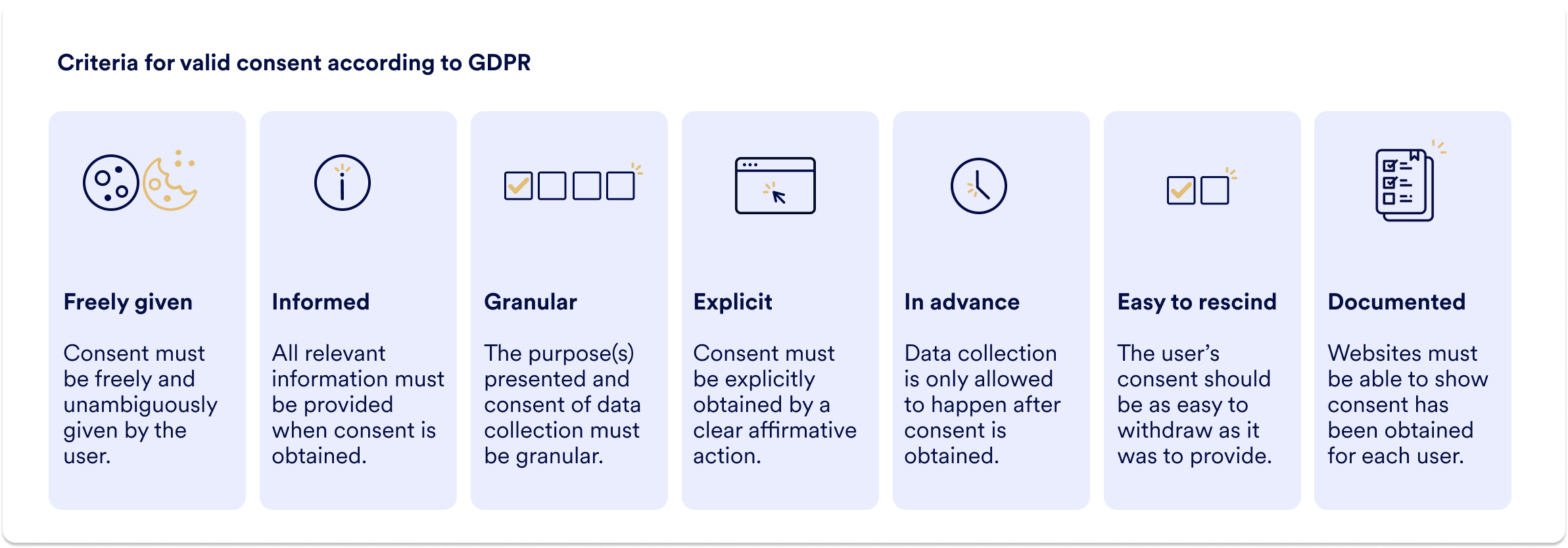
As we mentioned in 15 facts from 15 years with Mono, 47.5% of the submissions to our Best Website Competition 2022 used Mono Cookie Consent – a product that was first launched in the last half of 2021 – showing the great interest in our automated tool helping SMEs with GDPR compliance.
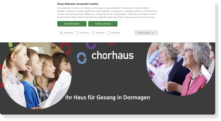
https://www.chorhaus-dormagen.de/
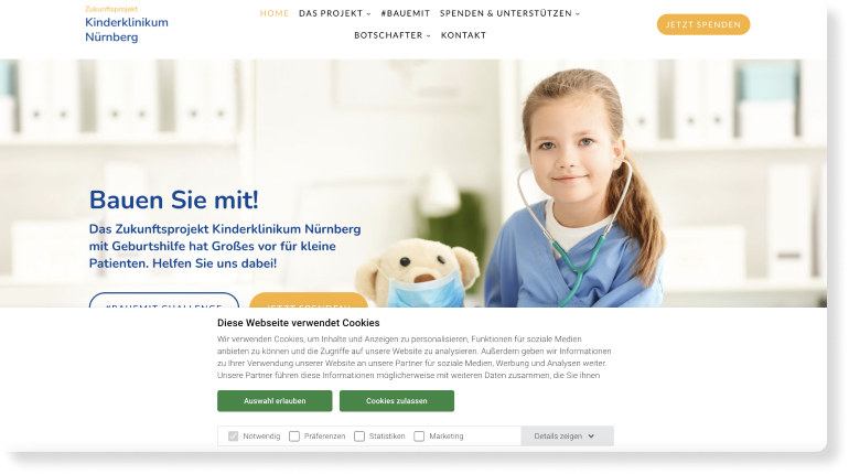
https://www.neubau-kinderklinikum.de/
Another way to build trust is to provide website visitors with a sense of security when doing business with the small business website – and that can be done by showing feedback, reviews, and ratings from other customers. While the majority of sites did not include reviews on them, for the sites that did, Google Reviews were used. The main areas where reviews were used included the homepage and the contact page. A unique use of reviews was seen in the footer, so the reviews would be visible on every page of the website.
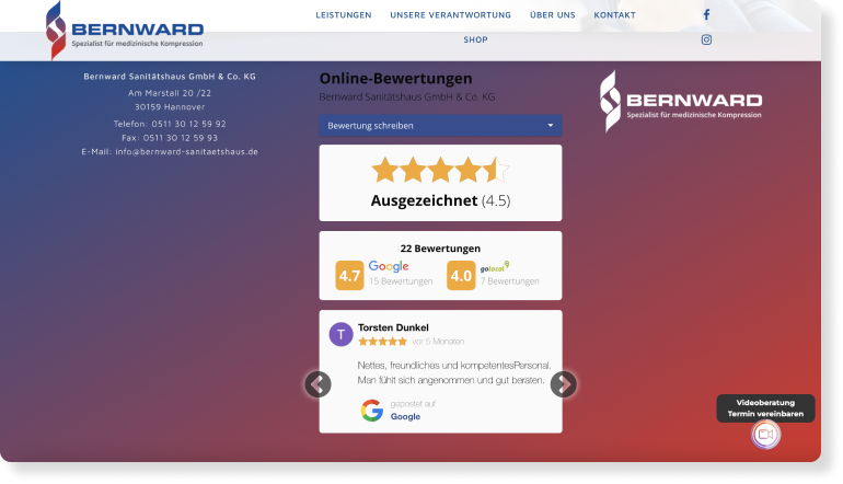
https://www.bernward-sanitaetshaus.de/
Conversion Opportunities
Throughout the submissions we saw a wide range of how conversions opportunities were utilized on websites. The amount of conversion possibilities is dependent, in part, on how big the site itself is. On larger sites that focused on renting or buying products, it was not uncommon to see conversion opportunities ranging in the hundreds. On smaller sites that focused on customers getting in touch, it was more common to have up to 20 or so conversions.
A general trend was that the majority of website submissions focused on hard conversions (buying, renting, booking, getting in contact, etc.) over soft conversions (signing up for the newsletter, reading more on other pages, etc.) considerably on the website.
Other general trends seen include:
• Call-to-action buttons and contact information in the header or top menu bar
• “Locked” or fixed call-to-action buttons that website visitors can always access
• Above-the-fold callouts on every page
• Contact information in the footer
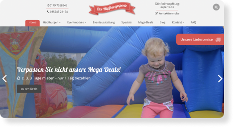
https://www.huepfburg-experte.de/huepfburgen
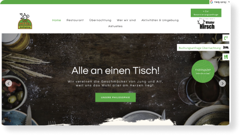
https://www.landhotel-sperlingsberg.de/
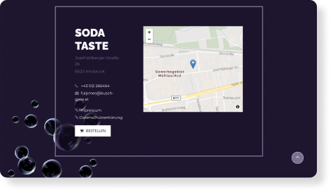
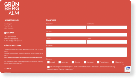
Yet there were a few conversion opportunities that stuck out, including altered footers that emphasized getting in contact to a much greater extent by either using a non-standard look and feel or including a contact form.
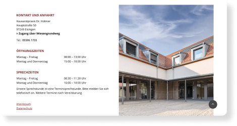
https://www.hausarzt-eisingen.de/
Accessible and Responsive Design:
First and foremost, why is accessible design important? As we wrote in On the Forefront of Accessible Web Design, 15% of the world’s population has a disability – and often this group is not taken into account when websites are designed. Creating a more accessible site increases the user experience for all, while also helping to ensure that more website visitors stay on the website.
Taking responsive design into account is also important, as we wrote in 5 user experience tips for small business websites, because “Small business websites need to look great and work well on different devices, so visitors and potential customers can have a great online experience - whether they are on a laptop or mobile device. Make sure your website looks at least as good as it does on desktop, or you’ll risk losing out on potential customers.”
So to sum up, it is important for a website designer to take accessibility and responsiveness into account when designing a website, as to create a better user experience for all website visitors and on all devices.
Yet, how can you measure website accessibility and responsiveness? There are a few tools available, including Google Lighthouse. Read our blog post here to learn more about what it is and what it measures. As we mentioned in 15 facts from 15 years with Mono, our Mono Templates, which consistently score in the 90th percentile on all parameters in the Google Lighthouse report, give websites a head start when it comes to responsiveness and accessibility. Mono templates, and the additional page and row layouts in the Mono Editor, are designed for the different viewports (desktop, tablet, and mobile).
And with our viewport editor, you can make sure that everything appears as it should on the different devices. Furthermore, you can also enable a few different accessibility features quickly and easily in the Mono Editor - read tips and how to do so here. With these easy-to-implement features, it is not surprising then that the average score for Accessibility, Best Practices, and SEO on the Google Lighthouse report for all website submissions to the 2022 competition was 93 or higher.

When reviewing the reports, the judging panel noticed an influx of small businesses using Progressive Web Apps (PWAs) - indicating the high importance of making the website experience mobile first. With more than a fourth of all competition entries having a PWA, the use of PWAs is on the rise. Still not quite sure what a PWA is and what the benefits are for SMEs to have one? Read more here and here.
Visuals
In our blog post article, How to make your website come alive, we wrote about the design trends for 2021 – and we saw many of these put into practice for the website entries created in 2021. Countless entries included parallax effects, animations, and videos as part of their website visuals to make the website experience more engaging for visitors.
Parallax effect:
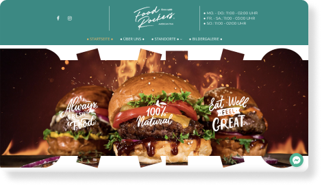
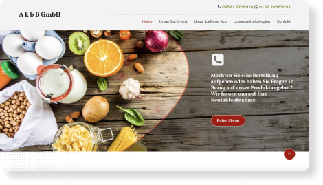
Parallax scrolling is defined by HubSpot as a tool “used to add visual interest to a website and engage users as they scroll through a web page. In a parallax scrolling effect, both the foreground and background are moving, but the background typically moves much more slowly, giving the illusion of depth.”
Take a look at the three examples below to see different ways the parallax effect has been implemented:
https://www.foodrockers-mrthai.eu/
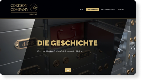
https://www.corkson-company.com/
Want to know how you can add this effect to your own site designs created in the Mono Editor? Read more here.
Animations
Other prominent visual extras include the use of animations. Animations were used on the majority of sites, with many sites animating texts, icons, call-to-action buttons and more. Take a look at the three examples below for inspiration:
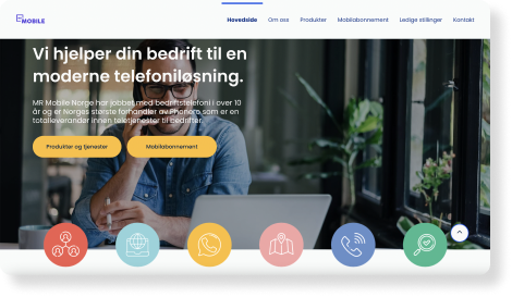
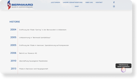
https://www.bernward-sanitaetshaus.de/ueber-uns
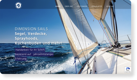
https://www.dimension-sails.net/
Videos
Videos were also used on many sites, either to give a sense of the atmosphere of a hotel, restaurant, or event locale, or as a portfolio of work done. Video serves as a quick way for potential customers to see if the small business in question offers the experience they are looking for. Take a look at the examples below to see how these sites used video throughout:
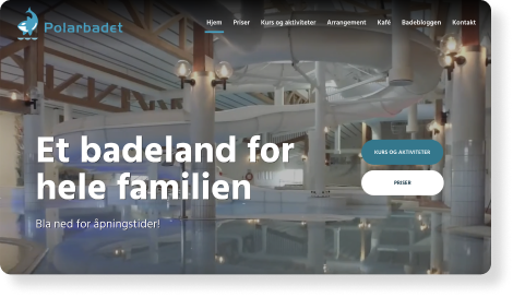
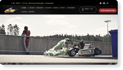
https://www.prokart-raceland.com/
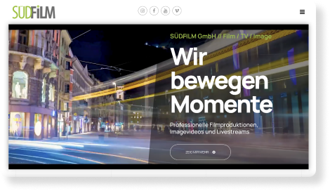
Interested in adding video to your small business website? Read how here.
The added fifth element logo flourish
While parallax effects, video, and animations were used throughout many of the submissions, there were also the use of added graphic elements on a few sites that stood out. What was once referred to as the fifth element of branding, is perhaps better known today as the practice of using various aspects of a company’s logo and branding to enhance the overall visual look and feel of design materials.
This can cover many terms today – logotype, logomark, submark, secondary mark, logo element, etc. Some of these terms are used interchangeably, or with slightly different definitions, but let’s just give a brief overview of important concepts.
As defined by 99designs, “A logotype is a logo centered around a company name or initials, while a logomark is a logo centered around a symbolic image or icon. The general term logo refers to all marks that represent a brand.”
Oregon Lane Studio defines a logo (sub)mark as a “less detailed version of your primary logo that can be used as a secondary mark similar to a watermark... It can also be used as social media profiles, website footers or favicons, back sides of business cards, etc... A logo submark allows for a more playful way to incorporate your branding into your designs.”
In this example, the header image is given added boost of branding with the addition of the logo mark as a transparent overlay on the image. The logo mark is also used as the company’s favicon.
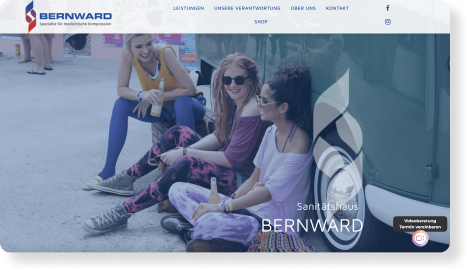
https://www.bernward-sanitaetshaus.de/
So, what are logo elements?
Logo elements, defined by Oregon Lane Studios, “can be anything from patterns, textures, icons, or anything else that ties your brand together and is recognizable through your branding... These typically don’t include words or brand names and are usually just an icon, design or pattern that can be used throughout all branding pieces. Elements should be used as a supplement to your branding.”
In the example below, you can see the half circular design elements used in the company’s logo. Further down the page, these elements are used to create a subtle, patterned background to emphasis company branding throughout the site.
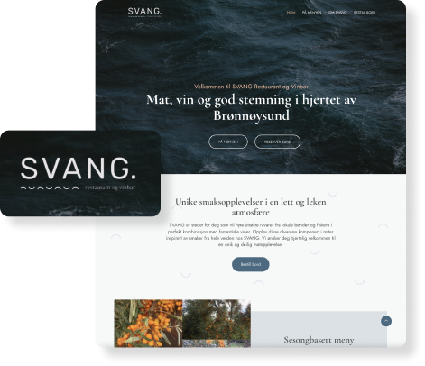
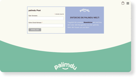
A perhaps even more subtle example can be seen below, where the curved separation between the newsletter sign-up and the footer sections on the webpage resembles the curved design element from the logo:
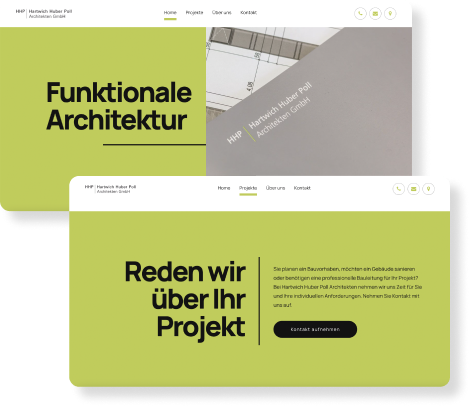
In these additional examples below, you can see that both logotype, logo elements and brand colors are used throughout the websites for a branded look and feel.
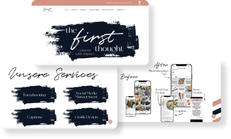
https://www.thefirstthought.at/
As you can see, how websites are branded can provide a very different - and distinctive - look and feel. Website designers can help SMEs present a more mature brand with these extra design flourishes and branding elements on SME websites, giving visitors and potential customers a great first impression of a business that pays attention to the details by using branded elements (type, logo marks and elements, and more) throughout the site.
This leads us, in part, to fonts and typography.
Fonts and Typography
Websites can help give a sense of branding through the use of fonts, but fonts - through type, weights, size, color, etc. - should also help direct the website visitor to information of interest. As website visitors skim content, it is important to minimize walls of text by breaking up content and utilizing distinctive headlines, subheaders, paragraph texts, call-to-action buttons and more. This can be done in many different ways, as seen in the different ways the submissions for the Best Website Competition addressed the use of fonts and typography.
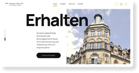
In the example below, you can see the website has eyecatching, short and to-the-point headlines. The size of the headline in relation to the paragraph text helps guide the website visitor to the areas of the page and the site that are of interest.
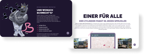
Another site that utilized size, as well as color, to distinguish headers and subheaders to make the most important information pop is seen here:
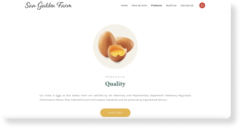
Additional examples of how websites used different font types, colors, and sizes for headlines and subheaders are shown here:
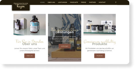
https://www.friseur-atelier-hagen.de/
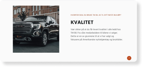
Through these many website examples, you can see that there are many facets to site design - as well as many ways to implement them. Yet through different styles and methods, these were a few current and - what we expect to be - upcoming trends we saw from the many wonderful website submissions we received for our Best Website Competition 2022. For even more great website design inspiration, check out our Best Website Competition showcase.
About Mono
Mono was founded on the belief that all small businesses deserve the same level of online presence and performance as larger companies. With Mono platforms and products, we want to provide small businesses an all-in-one solution to boost their online presence and sell more. We not only want to provide the digital tools to fulfill their digital presence needs, but we also want to share inspiration for small business owners and web designers for their digital journey.
