Andreas M Hansen | 04/02/2021
2021 design trends: Optimism for a new year
Most of us have happily entered the new year without looking back. At Mono, we like to make some predictions about design trends at the start of each year in order to give our partners an idea of the design opportunities that can help small businesses stand out all over the world.
Before we talk about trends for 2021, let’s look back at the 2020 design trends. We focused on emotional and engaging design, and we saw small businesses take advantage of these trends to make some truly beautiful websites.
In fact, we are currently running our annual competition for the best small business website made on the Mono platform. This competition is open to all Mono partners and provides an opportunity to showcase some of the most well-designed small business websites out there.
So, let’s get right into it. Below, I’ve compiled a list of design trends that I believe will shape the design landscape in 2021.
Optimistic Design
After what has been a rough year for most of us, the world is starting to feel optimistic about the future and looking forward to better times in 2021. I predict that this optimistic feeling will make its way into the design world.
Whereas previous years have been very focused on more toned down and neutral colors like sand/beige, I think 2021 is going to be a year where we all want a little extra color and freedom back in our lives.
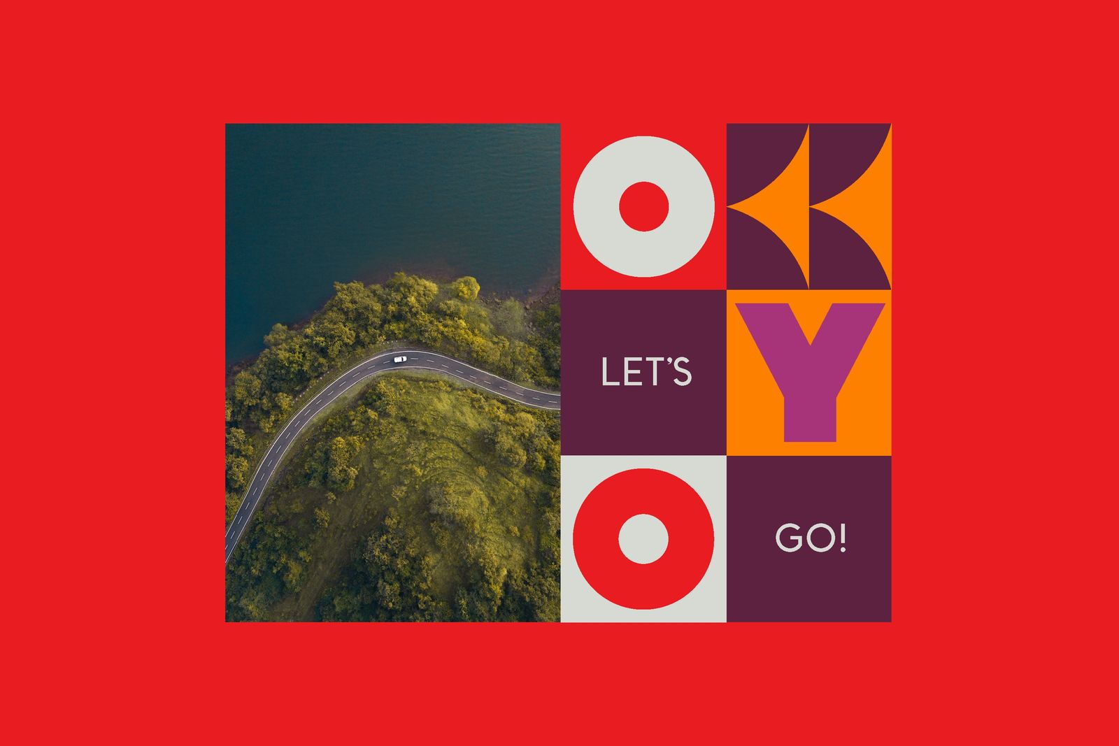
I think we’re going to see some strong identities emerge with bold and striking colors to both celebrate and rebel – like this brand work for OYO done by the American agency, wearecollins. It has some strong colors that offer a retro vibe, and together with the imagery it just takes us to another place.
Hand-drawn illustrations
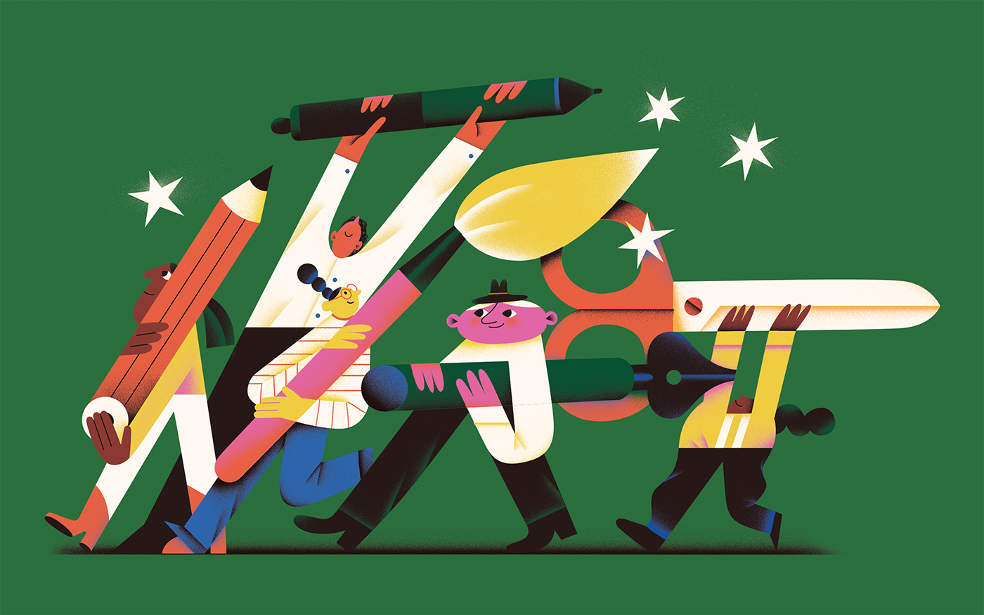
Hand-drawn illustration is nothing new in the design world, but nonetheless is a trend that will likely continue into 2021. While the previous years have been very focused on monochromatic illustrations like Mailchimp’s (still amazing) artwork, I believe 2021 is going to change that.
As I mentioned above, I also think that colors are going to make their way into illustration with a splash of collage and 3D effects - like this stunning work by Ukrainian artist, Tania Yakunova:
Community & human-centric design
It’s no secret that 2020 was a hard year for both big and small businesses across the globe. Some companies that weren’t previously digital were forced to become digital almost overnight in order to survive.
This is something that we at Mono are most passionate about. Helping small businesses succeed is our lifeblood – and is the reason why we are focused on providing small businesses with the digital tools they need to thrive and grow.
Small businesses are the driving force of local communities all over the world. And it is the people running these businesses, along with the patrons that support them, that give these communities life.
2021 is going to be a year where we will see many great small community brands and businesses becoming more digital and exploring their brand identity and approach. This will be enabled by better access to digital tools like Mono’s website builder.
Here’s a great example of a somewhat simple web design with a lot of character and color used for French brewery Lucky Folks - or this website for Corto Olive Oil.
Raw typography
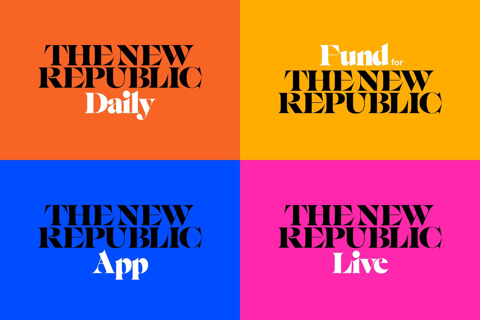
There’s no doubt that serif typefaces have already made quite an impact in 2020 and this will continue into 2021. Previous years have seen more classic serif fonts adding elegance and trust to the brands using them. This year, we’ll see the use of some unusual and dynamic fonts blown up on advertising and even websites, especially used in big headings.
Pentagram’s rebrand for The New Republic is an example of serif fonts with some more character.
Retro style
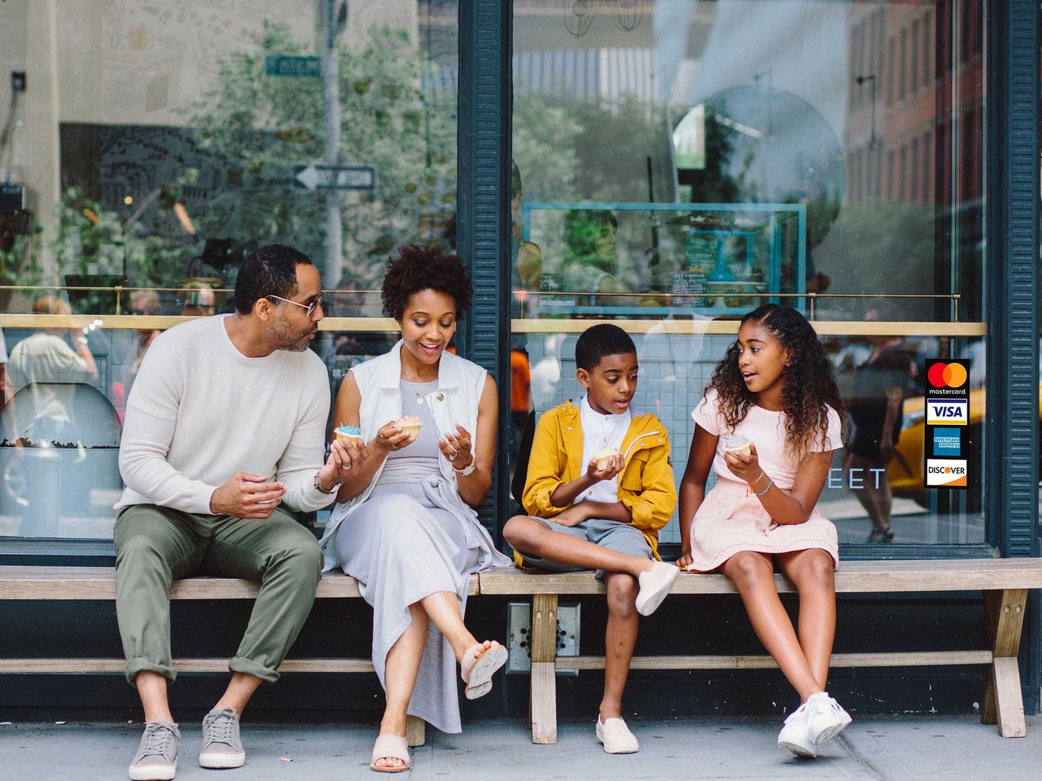
A little different from the colorful and playful elements I already mentioned, I think retro and vintage style is also going to play a big role in design in 2021. We’re all feeling very nostalgic, longing for simpler and cozier times. The simplicity of vintage/retro design is always something we look back at for visual cues, and we’re going to continue to do so.
Look at Mastercard’s rebrand done by Pentagram a few years ago. The de-saturated photography style and muted colors together with the monochrome black make the images look both vintage and modern at the same time.
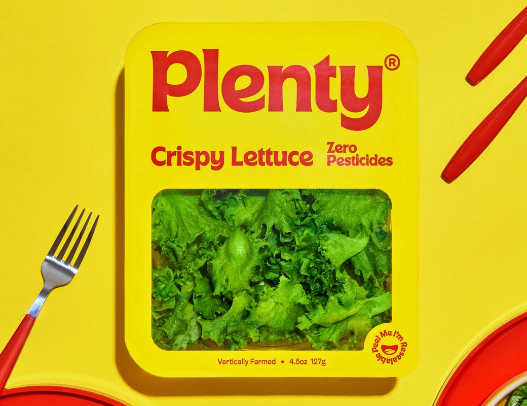
Or take this Plenty rebrand done by &Walsh, which combines both a very strong sans serif typeface and some bold colors for something unexpected and fantastic. The packaging especially carries that vintage style, giving it stand out status among the more traditional food packaging styles.
Accessible design
Some trends are thankfully continuing – like accessible & inclusive web design. This is an important reminder that good design is not always visual and should not only cater to a privileged audience.
Good design should be accessible. A big part of design is the communication and functionality of the elements. When it comes to digital design, accessible design is something that we’ve heard a lot of buzz about in the previous years, and it shows no signs of slowing down.
It’s important for the user experience that us designers are aware of being consistent with font sizes and weights, how to use the right contrast on our colors, and structuring the content to be screen-specific, as well as always adding accessible controls through the design. This isn’t only the right thing to do but also makes your design better for SEO, your conversion rate, and expanding your audience.
Some key components that can make your website more accessible and inclusive include:
- Clear contrast between background and text colors;
- Have only a few main CTAs. This makes it a lot easier for the user to locate that “buy” or “contact us” button;
- Add focus indicators to clearly indicate to visitors when they are moving among objects;
- Optimize form content;
- Clear, short, and easy-to-understand copywriting;
- Write useful alt tags for images;
- Write clear and actionable error messages.
Wrapping up
2021 will continue to be a year of freedom and hope, and expression in design. This will be demonstrated by striking imagery, bold colors, and human-centric design.
As the year goes on, some trends will be embraced, and some will be put on the sideline. What we know for sure is that the concept of good design is dynamic.
To make sure your website is well-designed, a good idea would be to start with one of Mono’s landing page, ecommerce, or website templates.
About the author
Andreas M Hansen is Mono’s Design Lead, responsible for the product design and the Mono brand. He brings over 12 years of experience in product design and brand identity creation to Mono, with extensive experience building brands and products from the ground up. His experience stems from the startup space, the corporate world and from running his own agency, where he worked with clients like Bang & Olufsen and Hèrmes. He has lived and worked abroad for companies in Hong Kong, the US, and Sweden. He joined Mono from Maersk, where he was Product Design Lead.