Mie Bilberg | 25/02/2021
How to build a high-converting landing page
In the game of conversion, the landing page is an important element for those who aim to grow their business online - no matter the size of your business or industry.
This article is for those people.
I have worked with digital marketing and online sales for over 10 years, and creating high-converting landing pages is one of my favorite things to do. I am a content marketeer to the bone, but I started my career as a sales manager, and sales is all about conversion funnels. Maybe it’s just me, but I get a great deal of joy when things convert. This is why landing pages are just so much fun to build and test.
This article will give you the tools you need to build a high-converting landing page. If you make it to the end, you'll get a free downloadable landing page template - the same one I use to build my own landing pages.
The digital marketing framework
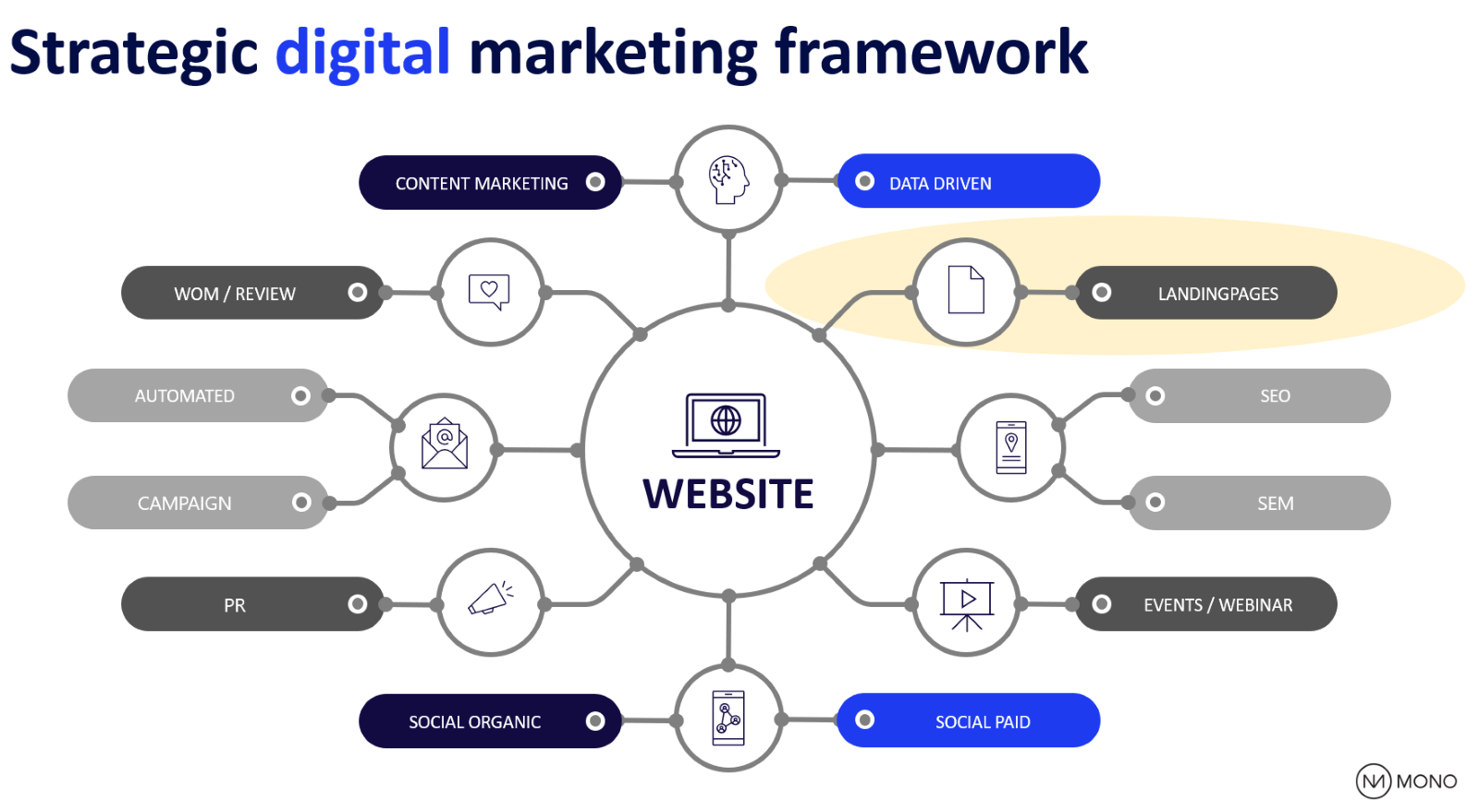
This is it - my secret framework. I have used this framework for years now and it can be copied by anyone, no matter if you are a digital service provider who sells marketing technology, a freelancer, an author, or if you are an agency selling knowledge and frameworks.
You can add or remove distribution channels when using this framework, but you should ideally always include landing pages.

What is a landing page?
A landing page is an online page where leads and potential customers visit, or “land”. The only goal a landing page has is to convert. How a conversion is defined is up to you, but a common conversion is a form submission. There are many factors that contribute to a landing page’s conversion rate (the percentage of users who land on a page and convert).
Keep reading and I will share my experience with you.
Your website homepage is not a landing page. The difference between the homepage of a website and a landing page is that a landing page is campaign-specific and the users will not necessarily see any other pages on your website apart from the campaign landing page.
For example, if you are running a webinar, you will need a landing page for people to register. There will likely be traffic coming in from multiple sources, including online ads, emails, and social media.
A website's homepage has several objectives, a big one is to build trust. A landing page has only one objective, which is to convert an unknown user to a known user, either because the user buys, joins, or downloads.
Why build a landing page?
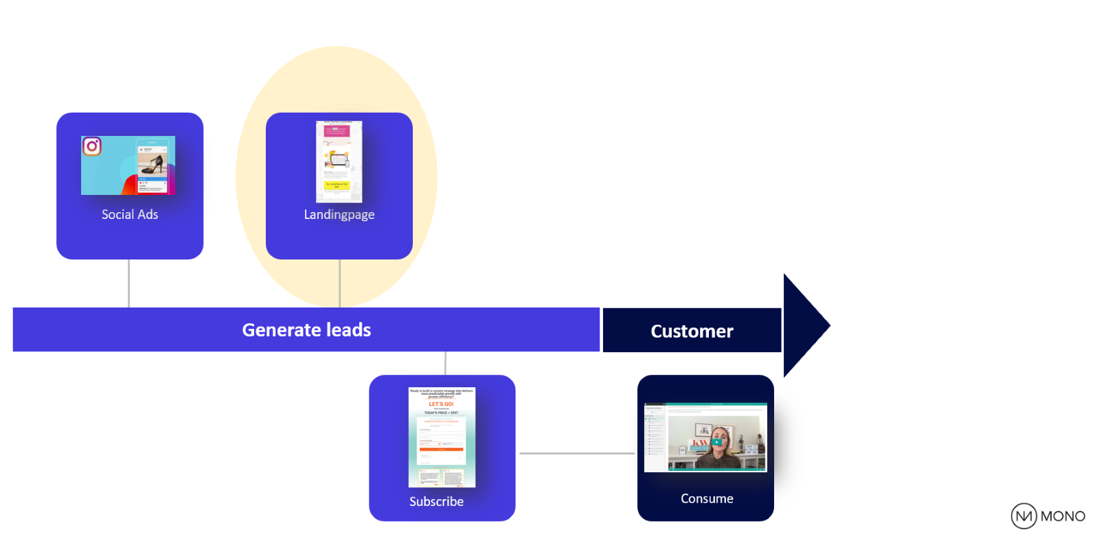
A landing page is the home base of your campaign. Here is an example customer journey from when a customer purchases an online class. The journey is very simple:
The customer met an advertisement on social media, the ad directed her to a landing page where she was convinced that she needed this online course, she ended up being a paying customer by filling in her information and submitting a form.

The vendor of this online course created a perfect campaign. While the social media ads were only pushing traffic to the landing page for a few months, the landing page is built to work for you as an ongoing campaign by converting organic traffic.
Many businesses build seasonal campaigns. Valentine’s Day is one such example. If your business is running a campaign around Valentine’s Day, you should invest in building a great Valentine’s Day landing page. Every year, you can activate this landing page with updated content and reactivate your paid media advertising to push traffic to the page.
How many landing pages should you build? As many as you like. You could build one for all of your products and you should build one for each campaign you run.
How to create a landing page optimized for conversion
A successful online presence, whether it’s a website or a landing page, has 3 main components:
- The tech stack– the platform and tools you use.
- The content – the copywriting, visuals, and incentives you use to convert users.
- The design – the user experience, is it designed to convert?
All three are equally important, and this is where lots of businesses go wrong. It’s an equal game. With a bad design, your great content will not convert. With a poor tech stack, will your great design not convert. With bad copywriting, will you not be able to convince the user.
So, let's assume that your landing page is built on best-in-class marketing technology like the Mono white label landing page builder. Below is what you should do with your content and how you should design your page.
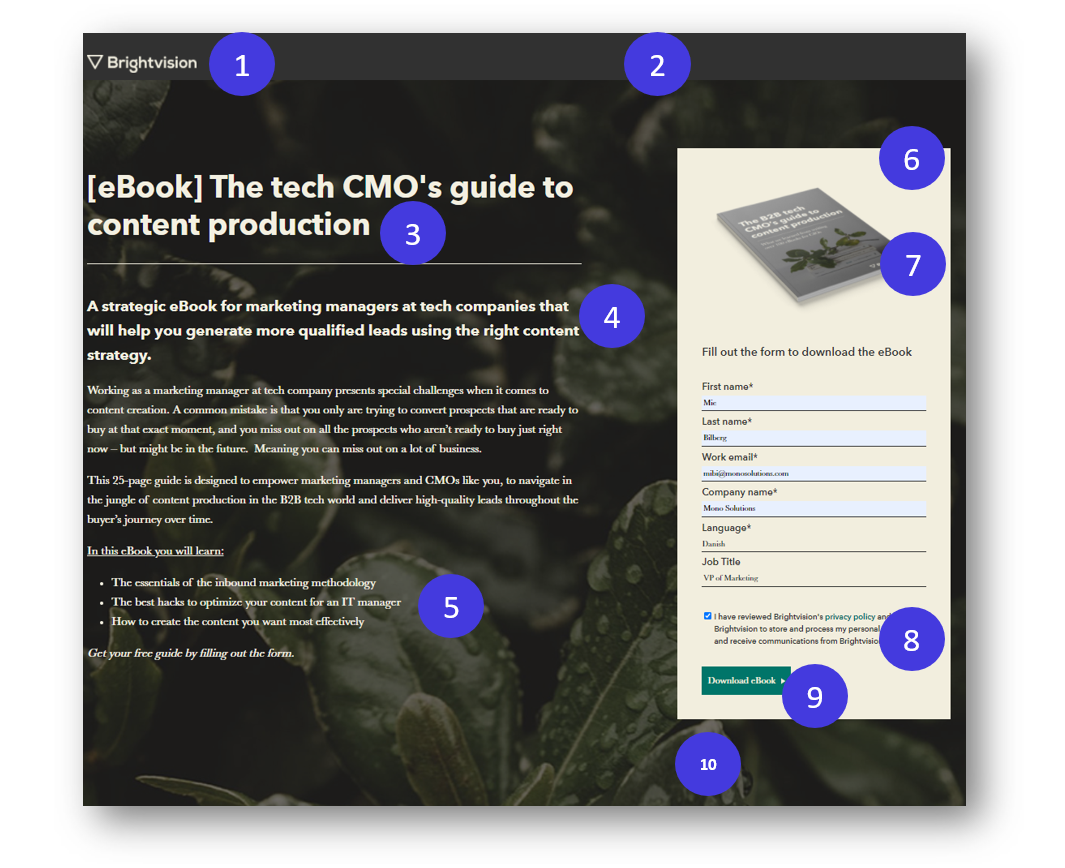
Here’s an example from Brightvison:
The main objective is to get the user converted to a known user, and the incentive is a freebie, the eBook.

What works well:
- A clear brand identity.
- No disturbing navigation menu.
- A clear and specific headline, which is calling on the persona this eBook is for.
- A specific and pain-focused value proposition.
- A description of what you will get by downloading this eBook. The copy is short and precise.
- The form is at the top of the page and easy to fill out. Note: Shorter forms with less data input gets more leads. Longer forms, with more data input, get more qualified leads. Find your middle-ground.
- An image of the eBook makes it more visually convincing.
- The lead capture form has included a privacy policy, with a description of what they plan to use your email address for. This is necessary according to EU data privacy laws like GDPR.
- The call-to-action button copy is compelling because it is short, direct, and tells you exactly what you will get.
- All the necessary information is displayed above the fold, allowing visitors to receive information without having to scroll up and down the page.
Cashing in on your landing page
Getting an email address in exchange for a free download may not be the hardest job, but what if the landing page needs to convert for sales and not “just” for a freebie.
With the right framework, this is not difficult, but we just need to work a little more for it. Take Strong Brand Social's campaign as an example.
In this case, the landing page is long and includes an entire product pitch.
It’s not possible to capture the entire landing page in one image. Instead, I will share my own recipe on how to use landing pages to directly increase your revenue, even while you’re sleeping.
The pitch, the psychology, and the sales funnel.
Any great sales manager knows that a pitch needs to be structured in order to be effective, and you need to work with the sales funnel from interest to action.
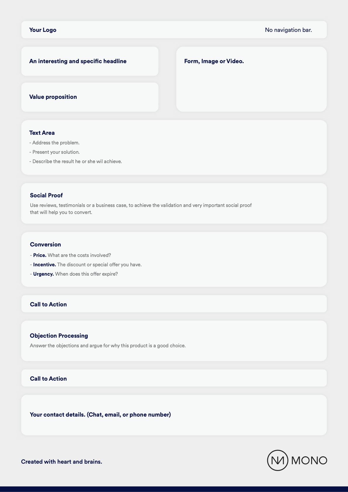
Here’s my blueprint for a perfect landing page:

Identity
You will need to establishing trust. This is why a landing page should always include your company logo and contact details.
Headline
Your headline is important. If your headline doesn’t seem interesting or relevant, then the rest of your landing page doesn’t matter, as the user will not pay attention to it.
A great copywriter can easily spend several days coming up with the right headline. But still, the work is not done. Ideally, the headline should be a/b tested to know which headline converts best.
You can view the headline as the beginning of a slide, where the job is to make the user slide down to the next piece of content where you introduce the value proposition of what you are trying to sell.
Value proposition
A great value proposition is specific and pain-focused. Clarity beats creativity here.
Social proof
If the user is scrolling down and still reading, then they are likely interested to know more. The next step for a user at this stage is validation. The user will look for other user’s opinions and social proof. A great landing page should include reviews from other customers.
Conversion
Finally, we made it to the conversion-area. It’s time to present the price, and the price should be presented in context, for the user to know whether the offer is a good deal or not.
When you offer a discount, showing the potential savings is important. If you are not able to do a discount, then you should consider including some kind of a bonus like access to an exclusive community or exclusive content. You will need an incentive to convince the user.
Call-to-action
After this section, a clear call-to-action button. The call-to-action button copy should be short, direct, and explaining exactly what the user will get. Like this one here on the Mono website:

Which call-to-action button converts best?
10 years ago, digital marketeers and digital designers often debated about the best color for high-converting call-to-action buttons. We learned that it doesn´t matter. The color of a call-to-action only needs to contrast with the background of the page to catch your eye.
Objection processing
Even after seeing a great call-to-action, some people might still not be convinced. Therefore, you should add a few more arguments and another call-to-action button. Finish your site with contact details to give the user an opportunity to reach out.
Takeaways
A high-converting landing page has 3 main components:
- The marketing technology,
- The content,
- The design.
You need all three to convert.
A landing page's main job is to convert. A lead capture form and the call-to-action button are key elements.
The first step for a digital campaign is to create a conversion-optimized landing page.
Start with a clear value proposition that is specific and pain-focused.
A landing page needs to do the pitch like a great sales manager who knows what it takes to close a deal.
At Mono Solutions, we invest heavily into building tools for creating world-class websites optimized for great UX and conversion. Check out our easy-to-use white label templates for building landing pages, websites, and more.
About the author
Mie Bilberg is the new VP of Marketing at Mono Solutions. Mie has a digital and strategic marketing background. Her roots are grounded in media and eCommerce, driven by a passion for customer experience, digital media, and content marketing. Most recently she was Head of Online Sales at Carlsberg Brewery where she launched a global eCommerce platform. Mie is a well-known face among the Danish eCommerce industry as she represents the jury that every year finds the best eCommerce businesses in Denmark. Mie brings experience from start-ups, and marketplaces like Just Eat - takeaway.com. She is the ex-Marketing Director for Metroxpress formerly owned by Tamedia.
About Mono
Mono is the leading European white-label landing page builder. Tailored for digital agencies, telcos, SaaS providers, online directories, and hosting companies, our platform empowers businesses to sell, create, and manage landing pages at scale. These businesses serve SMB customers. With Mono, you can effortlessly design and maintain professional landing pages that drive engagement and conversions, ensuring your clients receive top-notch performance and results. Get a trial here.